Context
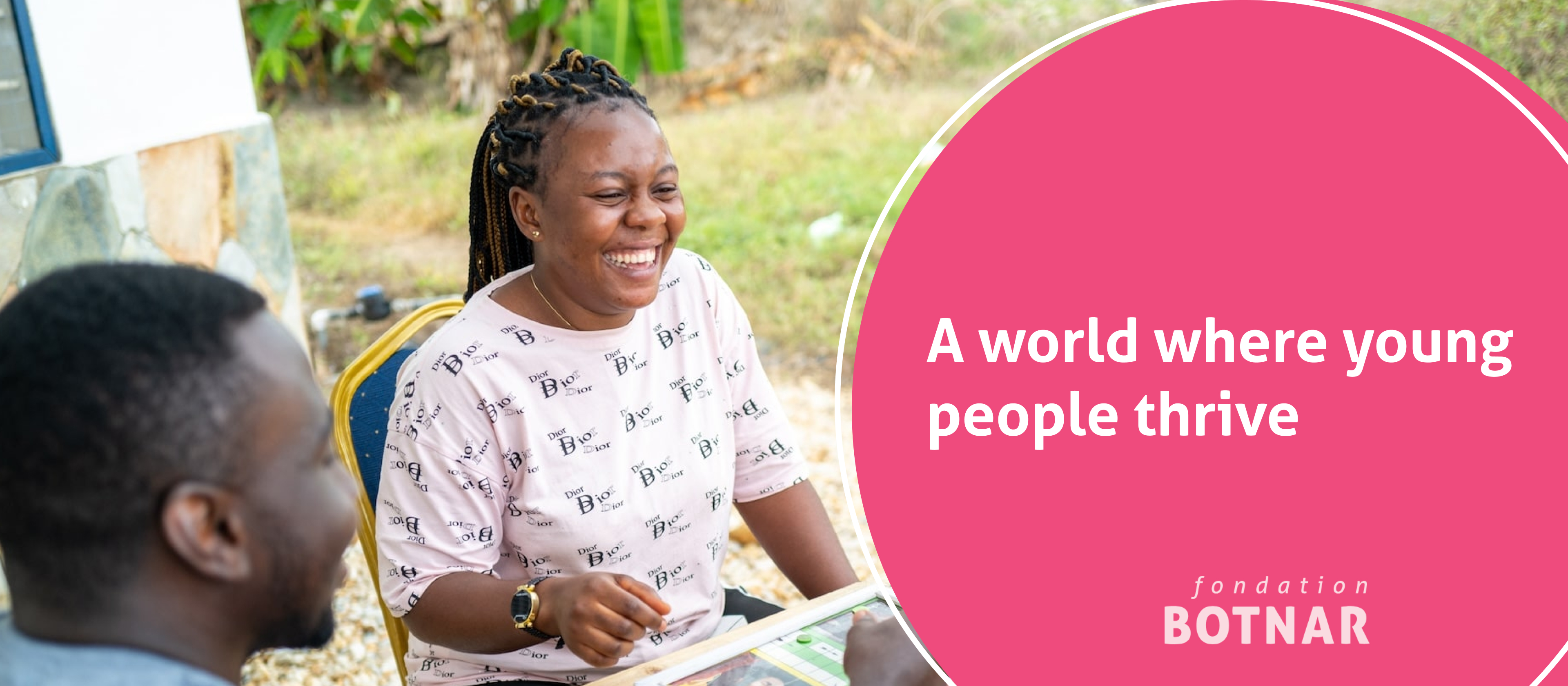
Fondation Botnar is a philanthropic foundation dedicated to the wellbeing of young people who live, learn, work, connect and play in urban and digital spaces around the world. To support their mission, the foundation continuously handles a vast amount of sensitive, private data from multiple global initiatives.
The challenge was to translate this wealth of information into clear internal narratives. I was brought in as a Data Visualization Expert to build a robust, consistent visual language in Figma that scales across their internal communications, moving away from fragmented layouts into a unified, professional ecosystem.
Objective
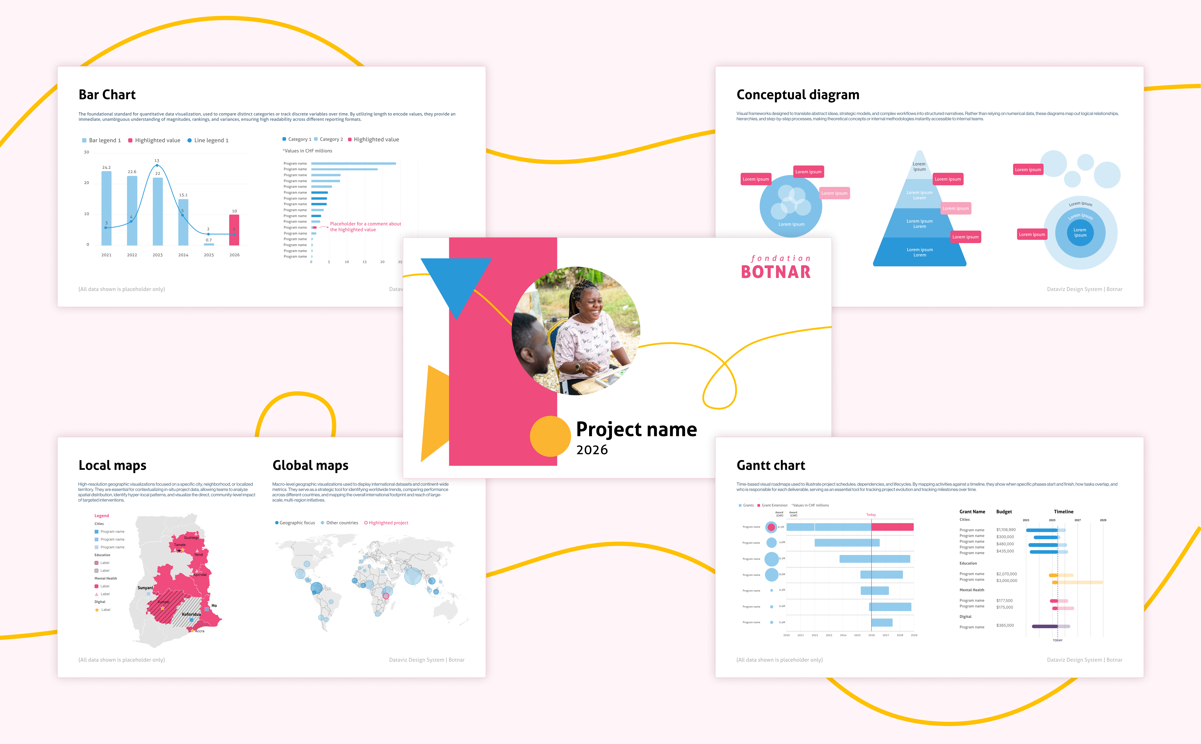
The main goal was to establish a consistent, scalable Data Visualization Design System based on the foundation’s existing brand identity guidelines. The system is designed to streamline how the team handles data, ensuring clarity, readability, and a structured approach to mapping information for different internal audiences.
Specifically, the system harmonizes three distinct types of visual data:
- Quantitative Data: Statistical charts, metrics, and key performance indicators.
- Qualitative Data: Mapping observations, evaluations, sense-making and learning, case studies, and non-numerical insights, utilizing concepts like "outcomes" and "outcome baskets" for precise categorization.
- Process & Conceptual Diagrams: Flowcharts, timelines, and framework visualizations.
By unifying the graphic styles and creating a strict logic for chart selection, this system supports the comprehension of data across multiple organizational tiers, from local project-level learning up to grant, theme, and foundation levels.
My Role
As the Data Visualization Expert on this project, my responsibilities span both strategic design system creation and ongoing production, managed entirely within Figma. Building upon the foundation's existing branding guidelines, I defined the visual rules and hierarchy for all chart types, designing the system specifically to highlight and emphasize key information when necessary.
Alongside this structural work, I collaborate directly with the foundation's private databases to draft and design internal reports in various formats. This ongoing production focuses on two main pillars: developing high-impact visualizations for grant proposals and funding extensions, and designing clear timelines to track the evolution of existing projects over time.
Deliverables
The primary outcome of this collaboration is a comprehensive set of data visualization guidelines built in Figma, ensuring visual consistency across the team. This system is supported by a steady delivery of custom charts and diagrams built from the foundation's internal databases, as well as secure, presentation-ready layouts and report assets optimized for internal tracking and stakeholder alignment.
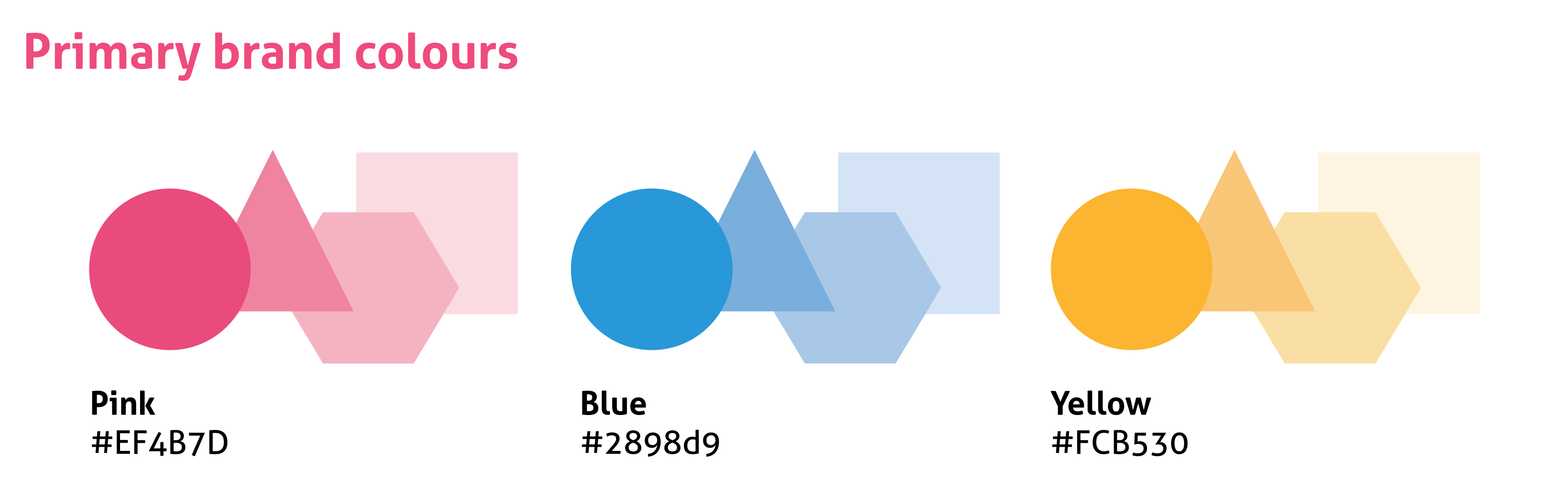
Dataviz guidelines examples