Concept
This project was born from a collaboration between the scientific illustration school Illustraciencia and Fernando Valladares, a scientist from the National Museum of Natural Sciences in Madrid. The goal was to create a compelling visual piece to help scientists communicate climate change more effectively. By combining visual storytelling with scientific accuracy, the aim was to reinforce complex environmental messages with accessible and powerful imagery.
Objective
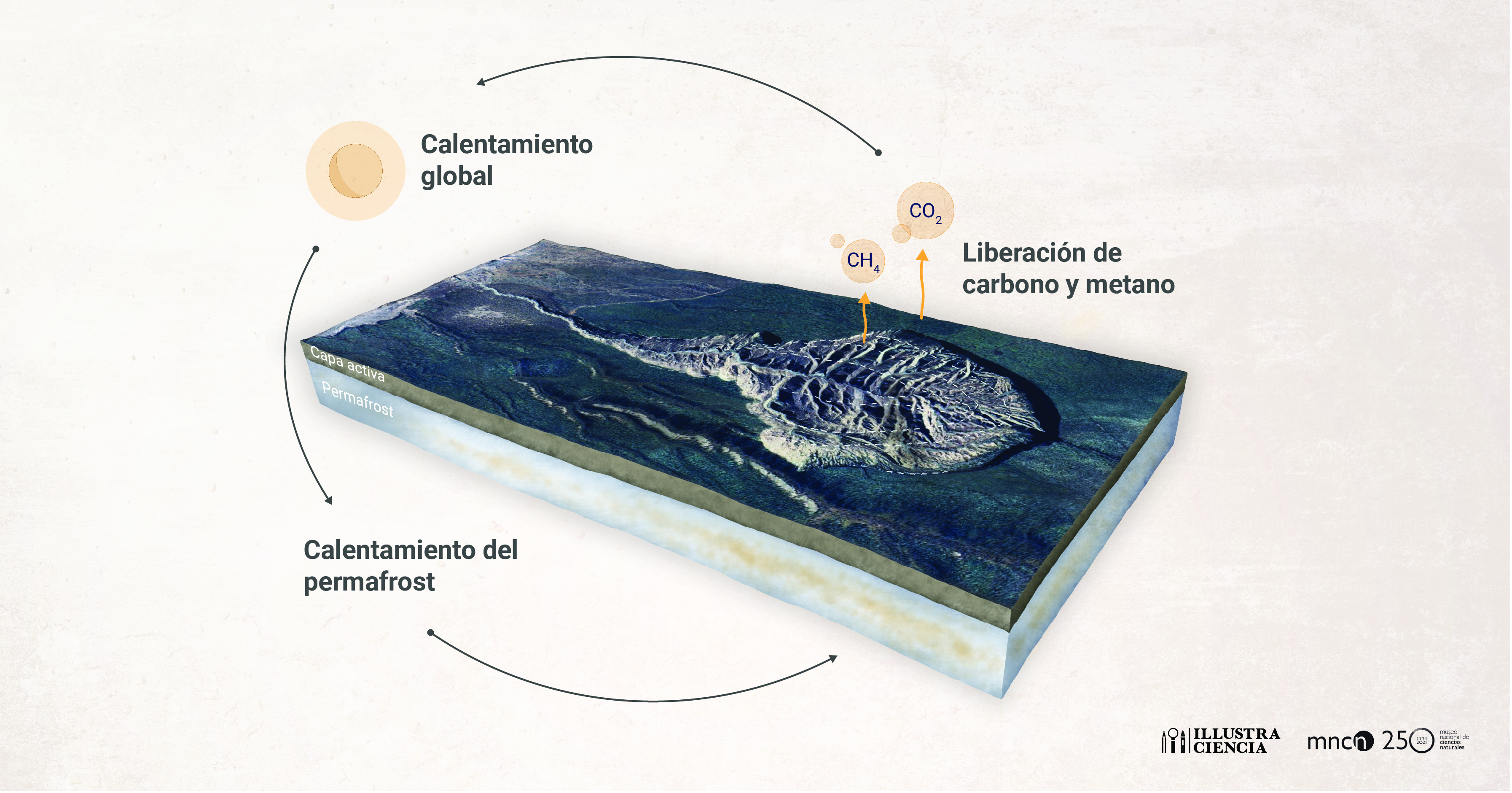
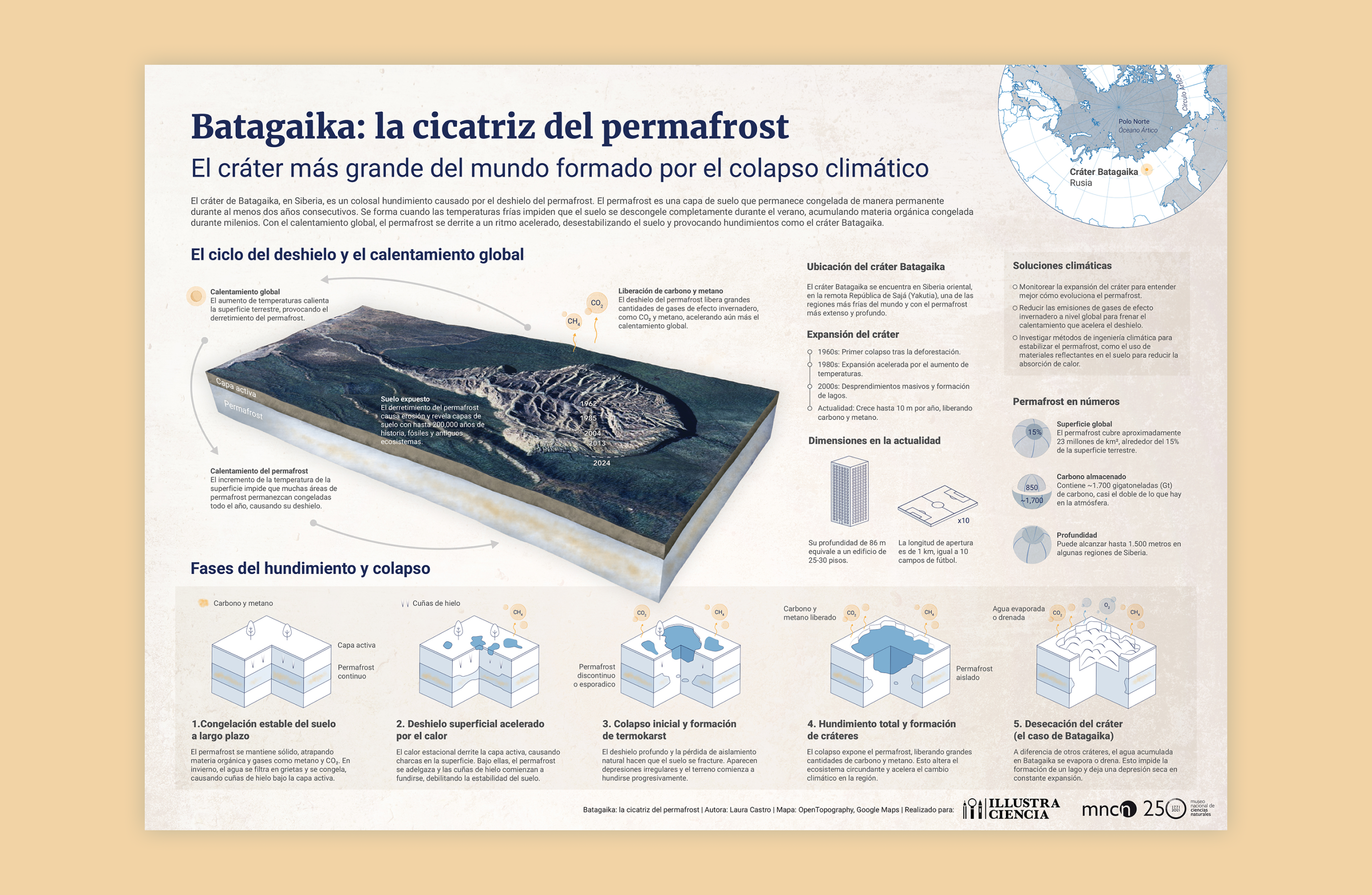
The objective of this infographic was to raise awareness about climate change and its consequences—specifically, the melting of permafrost and the feedback loops of global warming. I chose the Batagaika crater as the core narrative element: the largest permafrost crater in the world, and a dramatic example of how human intervention—deforestation in the 1960s—triggered irreversible damage. Through this case study, I wanted to highlight how seemingly localized actions can have long-term global consequences, challenging the way we think about environmental impact.
My Role
I led the project from start to finish, handling all aspects of the visual development—from identifying a relevant topic and conducting scientific research to creating the final artwork. The project was scientifically reviewed and guided by Fernando Valladares to ensure both the accuracy of the content and the clarity of the communication.
Process
After an in-depth research phase, I began sketching initial concepts with a clear intention: the Batagaika crater had to be the central visual focus. I wanted to highlight both its monumental scale and its symbolic power as a visual metaphor of climate change.
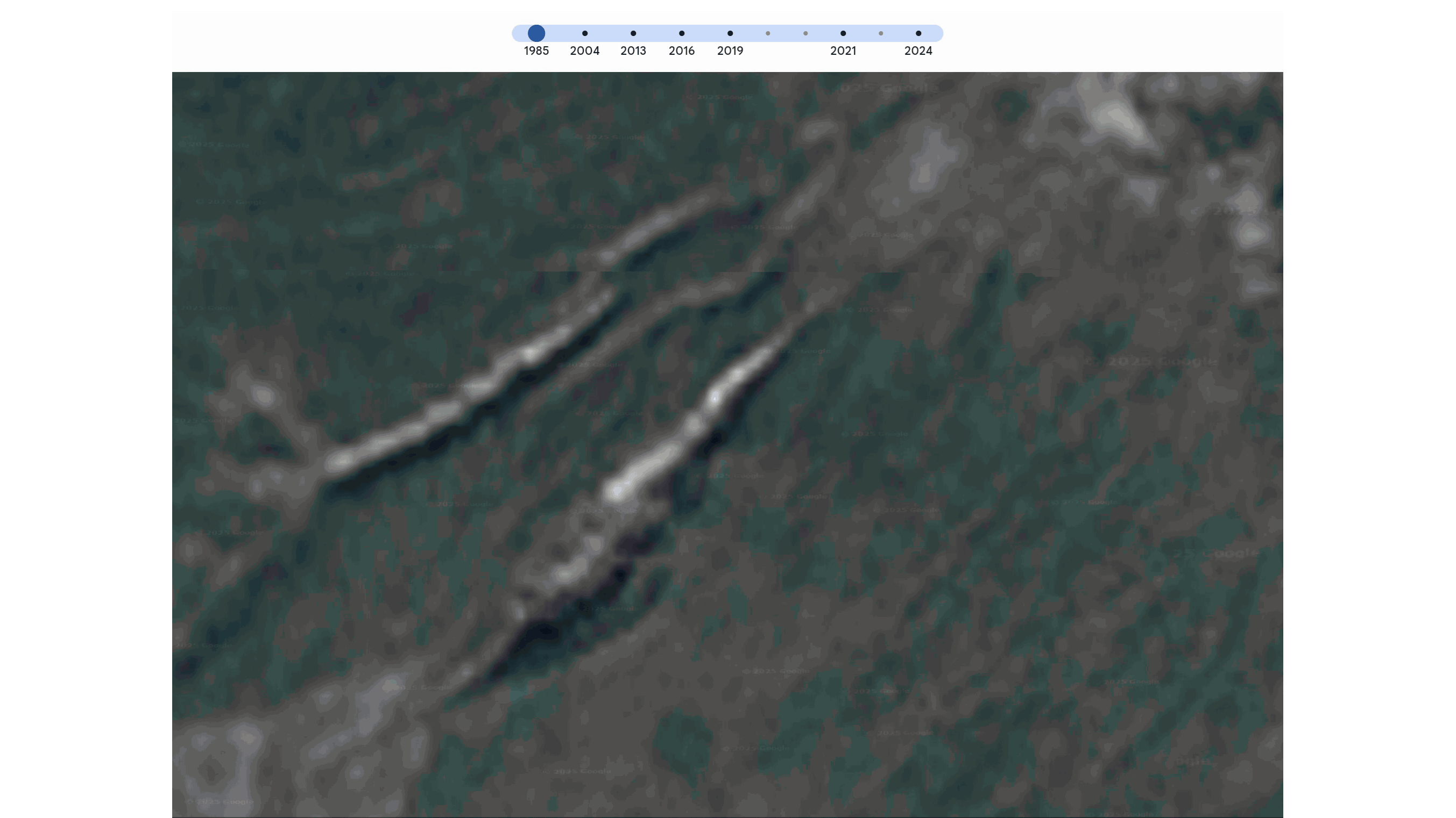
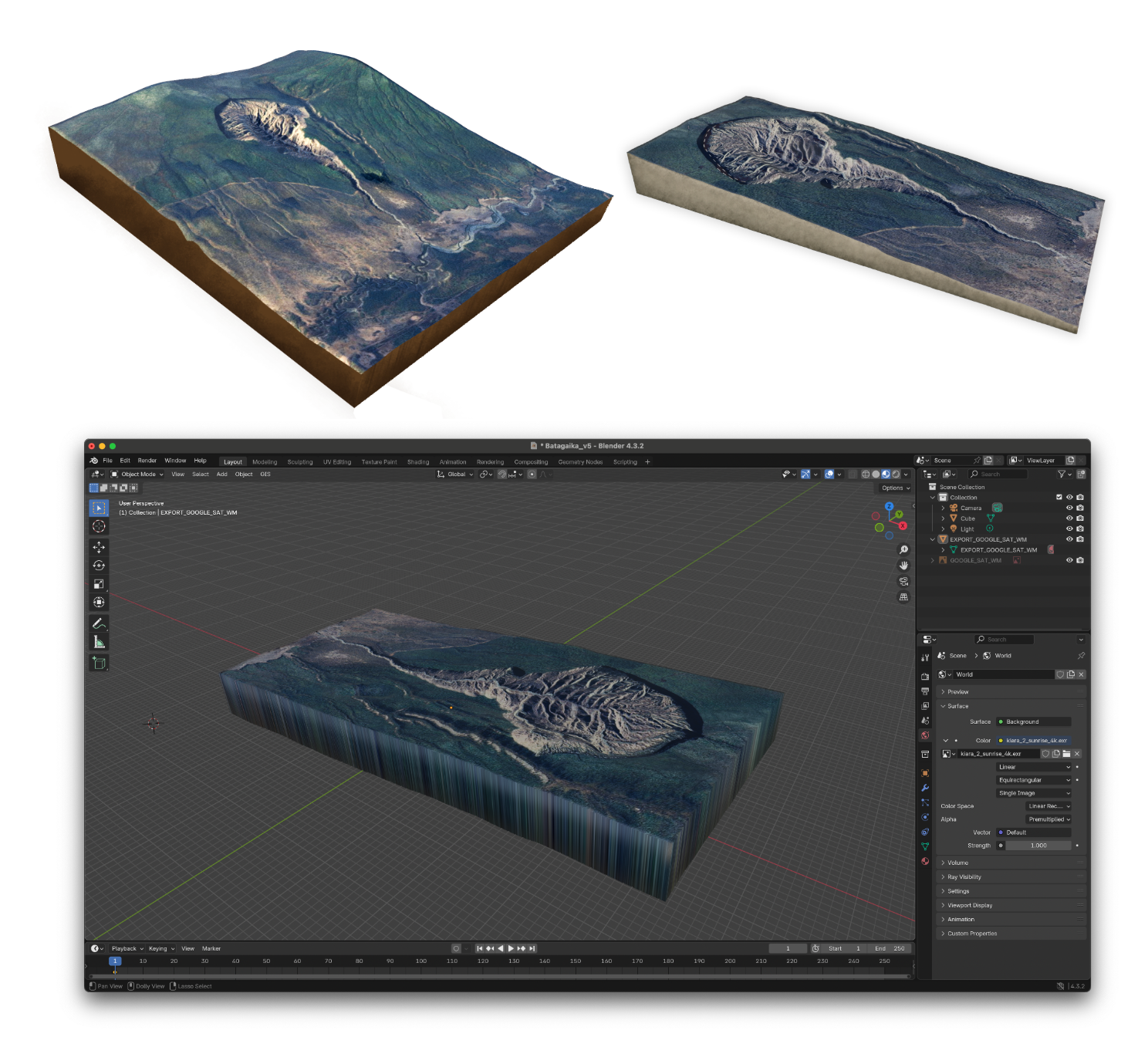
One of the biggest challenges was representing the vast dimensions of the crater and its evolution over time in a way that was both scientifically accurate and visually compelling. To support this narrative, I used satellite imagery from Google Maps to show the progression of the crater’s expansion over the years.
To further enhance the visual impact, I modeled the crater in 3D using Blender. This allowed me to recreate the landscape with depth and realism, providing viewers with an immersive sense of scale. The surrounding topography was also based on satellite data, anchoring the illustration in real-world geography.
Deliverables
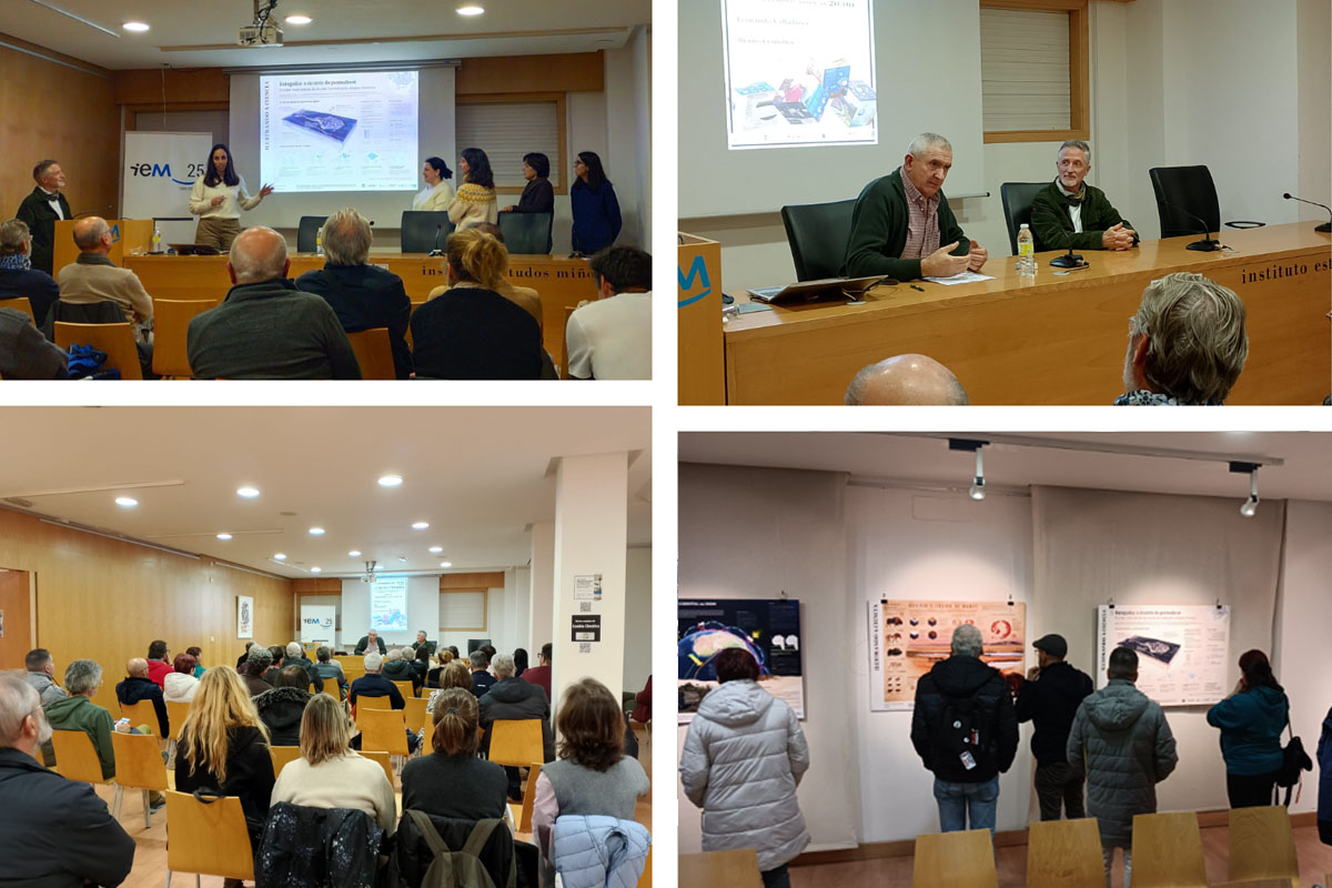
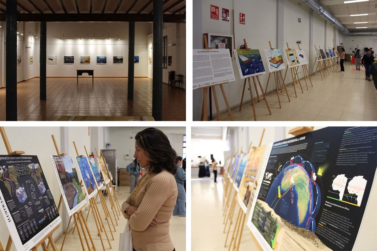
The final deliverable is an A2 printed poster, which will be showcased at the National Museum of Natural Sciences in Madrid as part of an infographic exhibition on climate change. In addition to the physical exhibition, the infographic will also be made available in digital format to be used in educational and scientific outreach settings, expanding its reach beyond the museum space and enabling further dialogue around climate science.
Community & Events
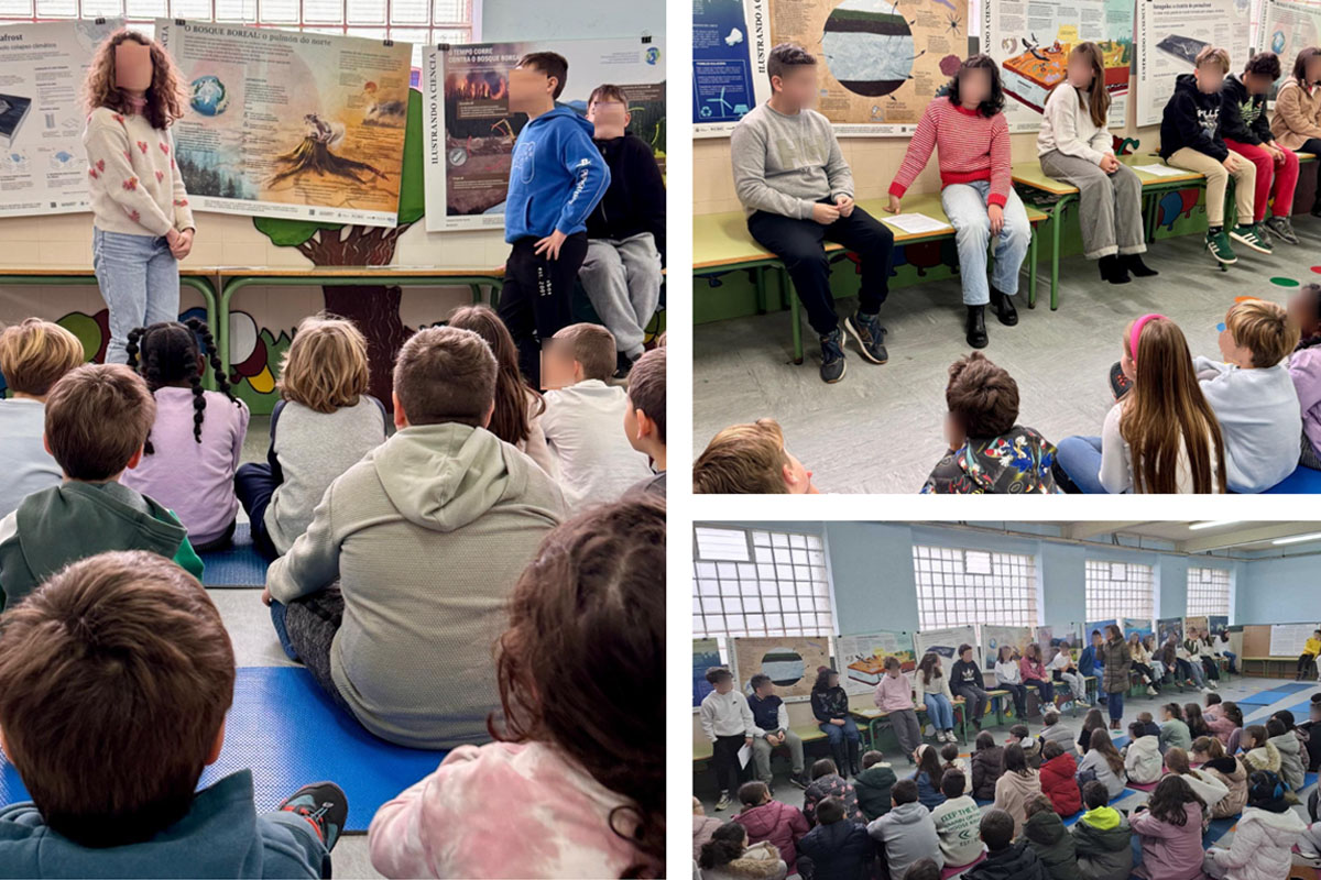
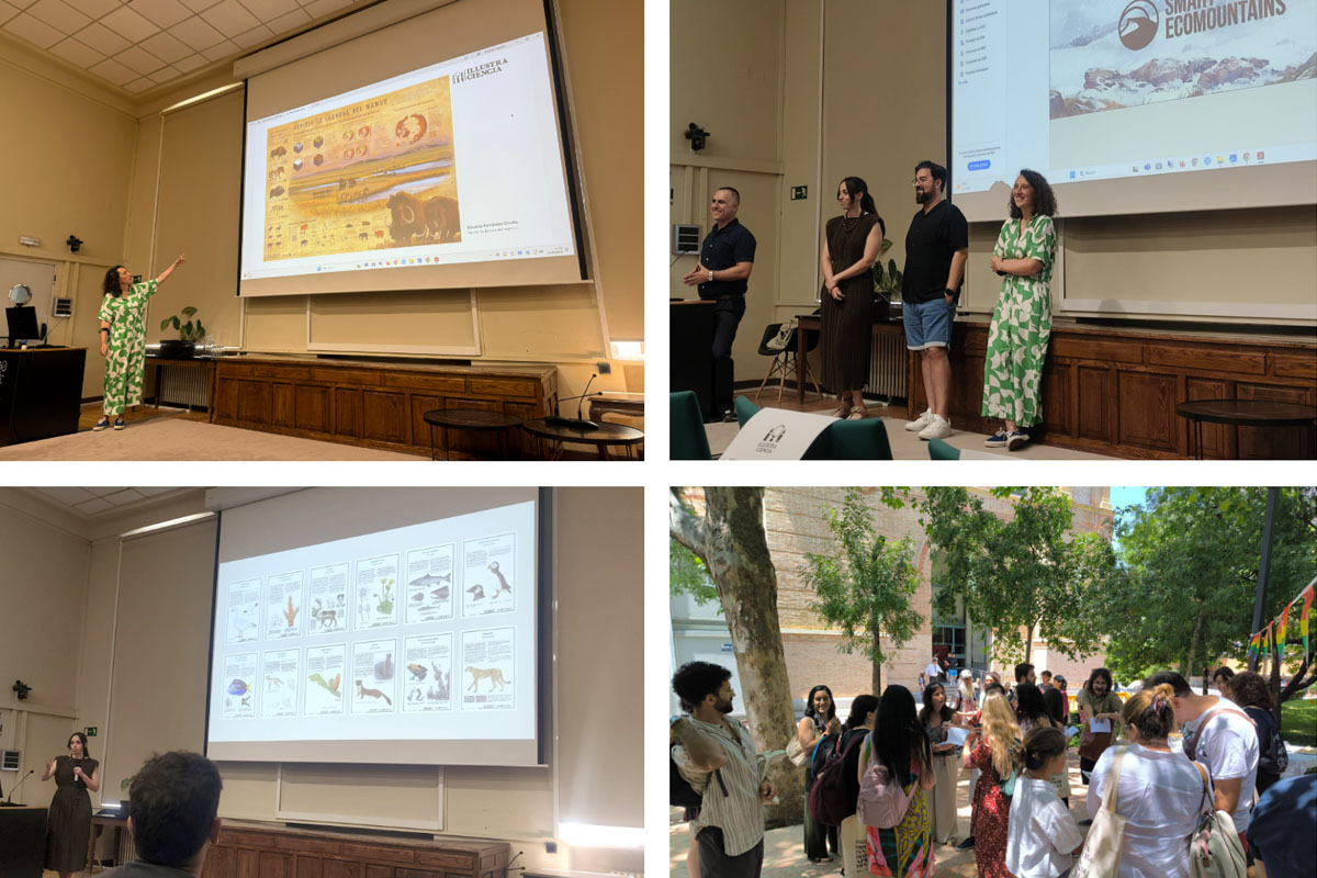
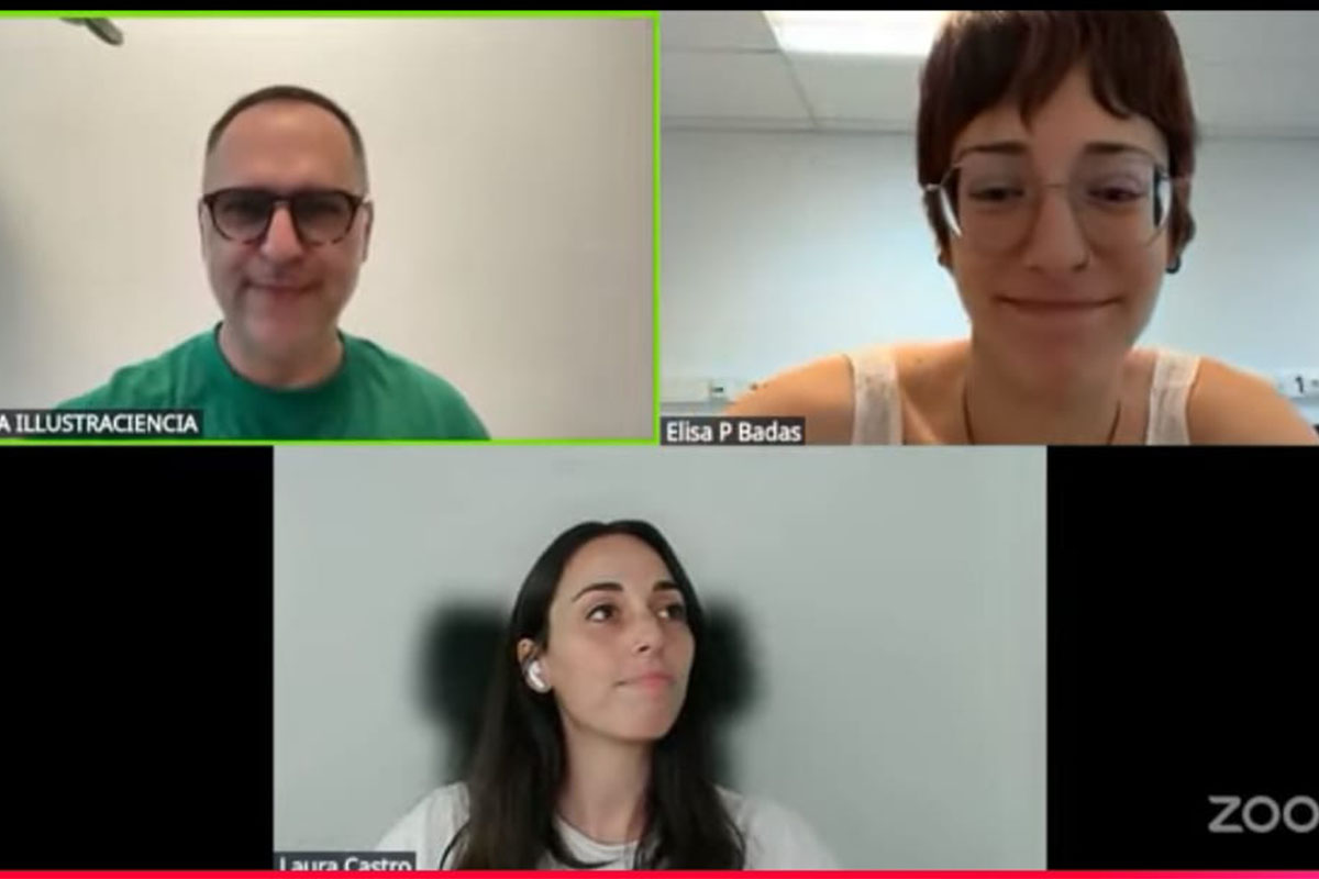
Beyond the technical development, the project Batagaika: The Scar of the Permafrost has been shared and discussed across various platforms and events. Below is a collection of moments from both online presentations and in-person exhibitions where the project was showcased. These interactions have been vital in gathering feedback and sparking conversations about climate change and infographics. For a deeper dive into the specific events and behind-the-scenes stories, you can explore the detailed recaps on my blog.
Acknowledgements
Special thanks to Clara Cerviño, Hugo Salais, and Miquel Baidal for initiating and coordinating this collaboration between scientists and visual communicators.