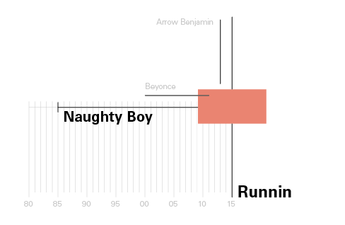
How to read it?
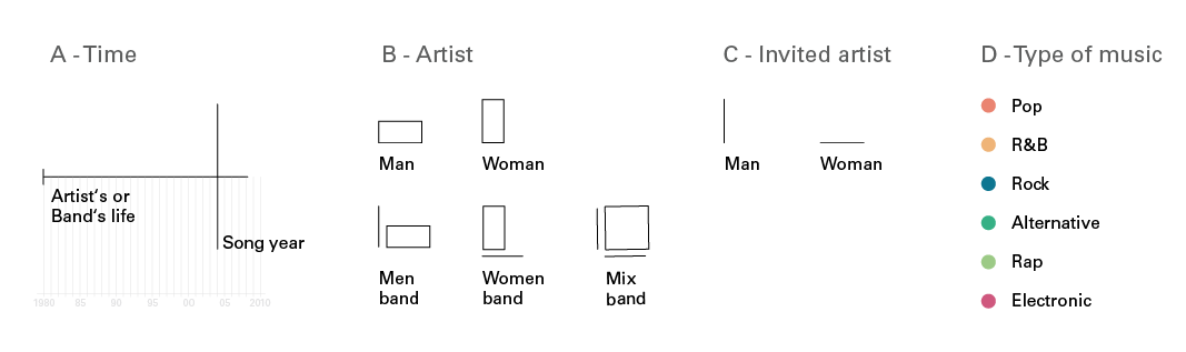
Scheme
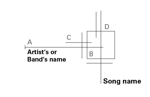
Example
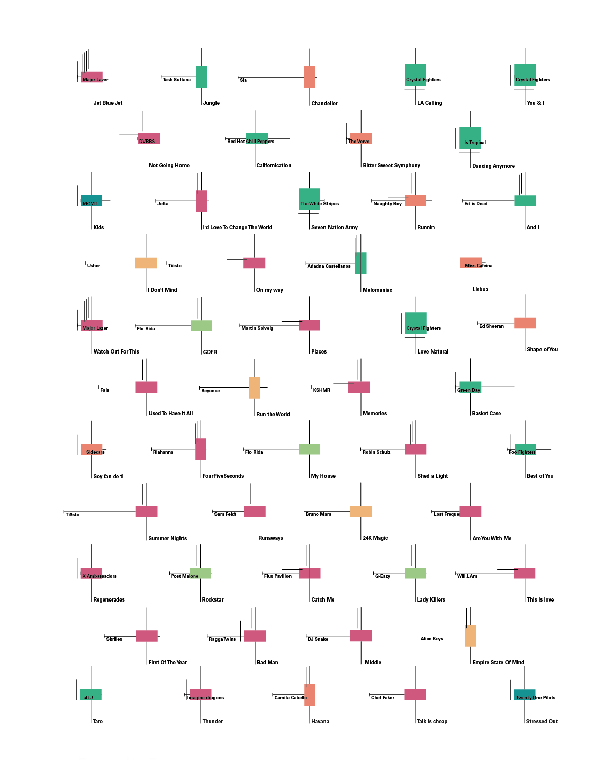
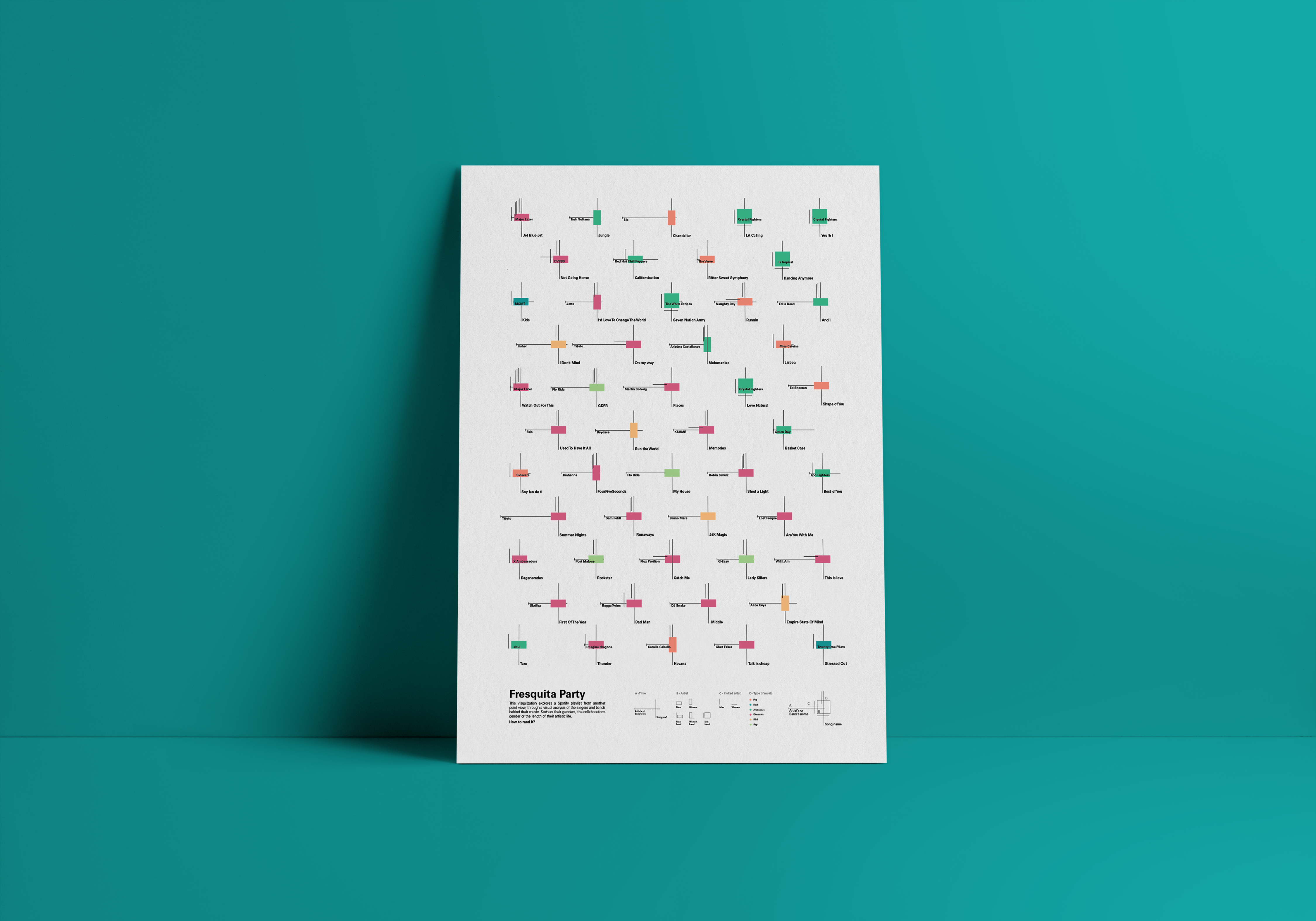
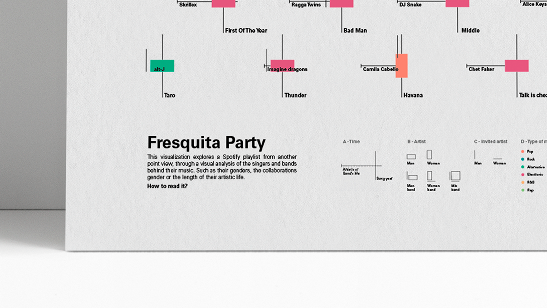
This visualization explores a Spotify playlist of 60 songs from another point view, through a visual analysis of the singers and bands behind their music.
The idea arises from a personal curiosity, keeping on mind the social movements that are nowadays to empower women to ask me questions like: Who is behind the music that I listen to? Are there many women Dj? Are they young? Is the song I'm listening to made at the beginning or end of his career?
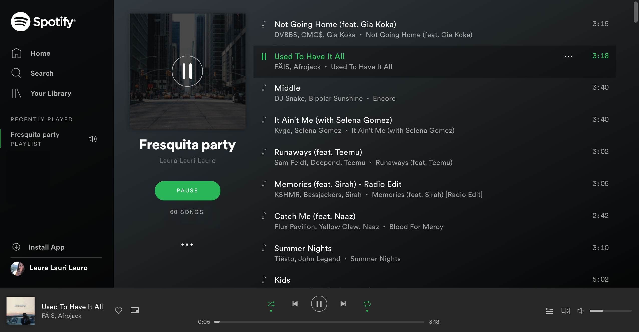
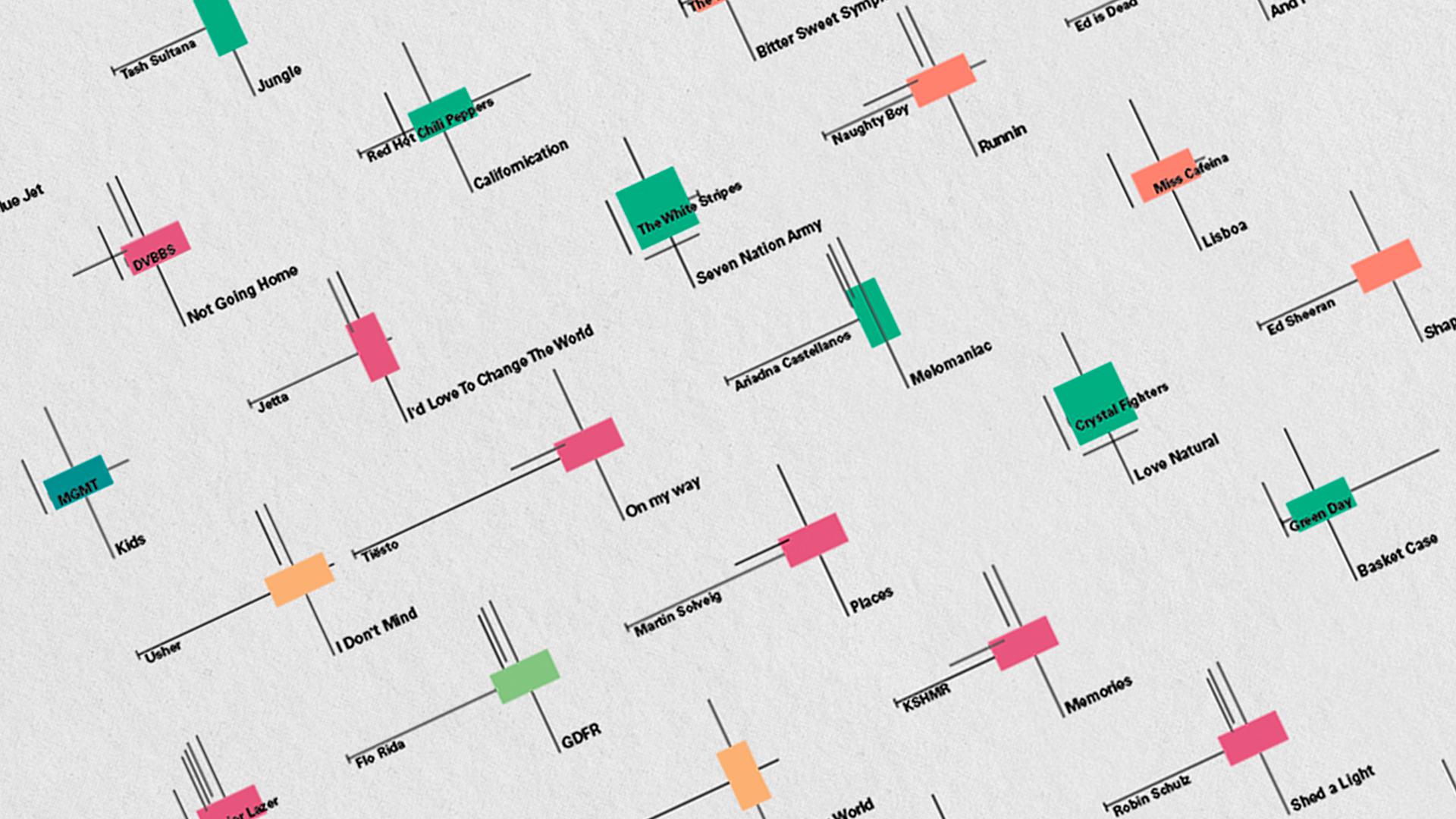
I picked up the list of spotify that I was listening to the most at that moment and watched who was behind the music. Collecting the data: Author's name, Start date of the trajectory, Date of the song, Genre of the author/s, Genre of the collaborations, Nationality, Type of song
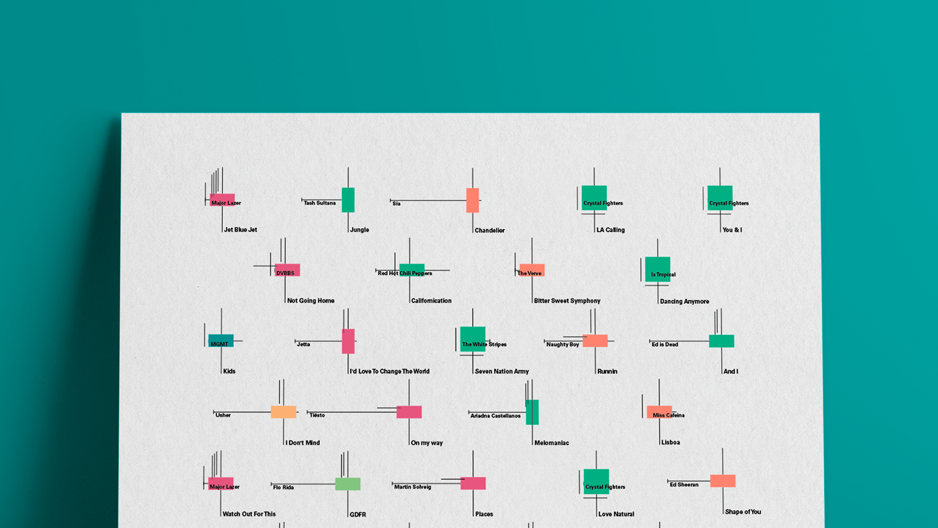
Song: I'd Love To Change The World
Date of the song: 2014
Type of song: Electronic music, Indie pop
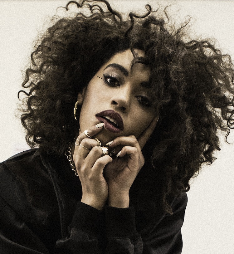
Author's name: Jetta
Start date of the trajectory: 1989
Genre of the author/s: Female
Nationality: British
Collaboration names: Matstubs
Genre of the collaborations: Male

Song: And I
Date of the song: 2016
Type of song: Dance/Electronic
Author's name: Ed is Dead
Start date of the trajectory: 1983
Genre of the author/s: Male
Nationality: Spanish
Collaboration names: WOMOH, NN
Genre of the collaborations: Male
Download the dataset here.
After analyzing the data, I have come to the conclusion that most of the music I listen to is created by men, while most of the collaborations are female voices. Since the playlist has only 60 songs, the conclusion is not very relevant, but I think it is a small example of the music industry.
As it is said in the article by Caitlin Kelley in Forbes "Statistics about artists reveal a deep gender disparity on the charts. Only 21.7 percent of artists who put out the top 700 songs since 2012 were female. Among the 1,455 artists studied, there is a gender ratio of 4.8 male artists to every one female artist."